Desert Drifter Supply Co.
A jewelry studio that was in need of a brand that reflected the quality of their craftsmanship.
Small brands often outgrow how they first show up.
Desert Drifter Jewelry is rooted in natural texture, simple forms, and desert-inspired design. The goal of this project was to bring that feeling into a clearer, more cohesive identity across every touchpoint.
We developed a full brand system including logo variations, a badge and icon, color palette, typography, packaging, and supporting visuals. Everything was designed to feel consistent with the product itself—minimal, warm, and grounded.


Because this is still a small business, we worked within real budget constraints and focused on where the experience could feel elevated without overcomplicating production. That showed up most in the packaging.
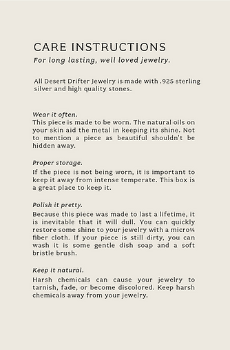
We used natural materials and texture as the foundation—leather cord, a stamped logo on a raw, textured box, and layered details that feel intentional rather than excessive. The care insert was designed as an experience on its own, with an opaque overlay featuring a desert and horse photograph placed over the instructions. The whole package is tied together with simple, tactile finishing details like leather cord and an elk antler slice.
Alongside the identity system, we created photography that carries the same tone. Nothing overly styled—just intentional imagery that lets the materials and pieces speak for themselves.
The result is a brand that now feels cohesive and considered at every level. From packaging to social to web, everything works together to tell the same story.

When a brand is this personal, how it’s experienced matters just as much as how it’s made.